Dice Design System
In 2024, I joined BetMGM to help build Dice, a multi-brand design system supporting Sports, Casino, and Player Experience across a shared global platform.
My work focused on building the foundations that would allow brands to maintain their own identities without requiring engineering to rebuild the same experiences. I led token architecture and component design, worked closely with engineering to align design and code, and helped teams adopt the system through education and ongoing support.
Together, we consolidated 350+ one-off implementations into a library of 32 global components, established Figma and Storybook parity, and created a shared foundation for how teams build. The work was recognized with the 2025 Zeroheight Best Collaboration Award.
- Company
- BetMGM & Entain
- Role
- Senior Design Systems Designer
- Timeline
- 2024–2026
- Team
- 8 DS designers
- 10+ DS engineers

Background
One Codebase, 40+ Brands
BetMGM was founded in 2018 as a joint venture between MGM Resorts International and Entain, bringing together MGM’s entertainment expertise and Entain’s global gaming technology.
Behind the scenes, BetMGM operates on Entain’s shared technical platform, a monorepo supporting 40+ sports betting and gaming brands worldwide.
Each brand has its own design teams and product priorities, but they all rely on a centralized engineering organization to build and maintain the platform.
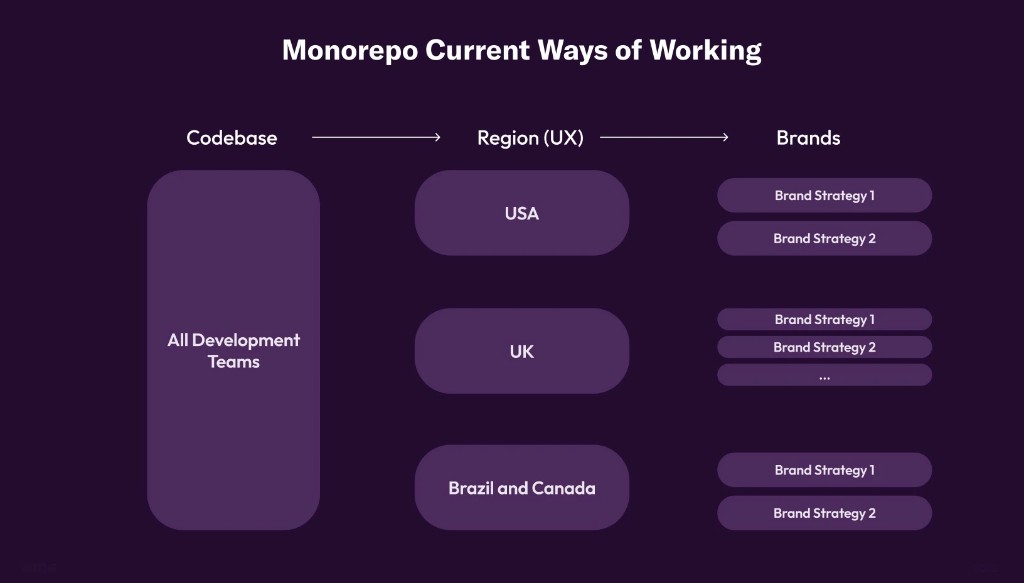
In theory, sharing a codebase should make building faster and more consistent. In practice, things weren’t quite that simple.
Brands needed flexibility to support their own markets and product experiences, but there was little alignment around what should remain consistent and what could be customized. Design teams worked independently, often solving the same problems without knowing another team had already built a solution.
Over time, that created four recurring challenges:
- Inconsistent
- No central source of truth for shared components and patterns.
- Messy
- New solutions were often built on top of existing workarounds.
- Slow to build
- Engineering spent time navigating and maintaining duplicate implementations.
- Misaligned
- What designers created didn’t always match what engineering could build.




Finding balance
Finding the balance between consistency and autonomy
Before building Dice, we met with designers and engineers across the organization to better understand their needs and where things were breaking down.
What became clear was that both groups needed something different.
Engineering needed a consistent foundation that could scale across brands without increasing maintenance. Designers needed enough flexibility to support their individual brand identities and product experiences.
The challenge wasn’t simply making everything consistent. It was figuring out what should be shared, what could be customized, and how both could work together.
How might we
Figure out what should be shared, what could be customized, and how both could work together?
That became the foundation for how we approached Dice.
Solution
Dice: one foundation, many identities
We built Dice as a shared design system flexible enough to support 40+ brand identities while maintaining the consistency needed to scale globally.
Rather than asking every brand to adopt the same visual language, we focused on creating a common foundation that could adapt to different brands without requiring separate component implementations.
The work extended beyond the library itself. It included the foundations, architecture, collaboration processes, and education needed to make the system something teams could actually use.
-
01
Foundations
We started by establishing the core foundations that components and product experiences would share.
This included color, spacing, typography, grids, and elevation, creating a consistent starting point while allowing individual brands to express their own visual identities.
These decisions gave designers a shared language and helped engineering work from a more predictable set of values.
-

Color
-
Spacing
-
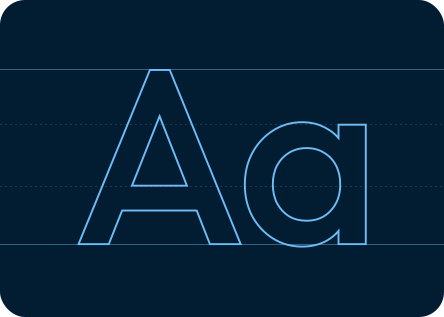
Type
-
Grid
-

Elevation
-
-
02
Semantic Architecture
One of the most important decisions was separating a brand’s visual identity from the components themselves.
I helped architect a three-tier token system, moving from reference values to semantic tokens and component-level tokens.
Rather than hardcoding styling into individual components, we could define how a component should behave and allow each brand to determine how it should look.
This meant the same component could support different colors, typography, and styling across brands without requiring engineering to build and maintain separate versions.
The result was a foundation that supported brand differentiation without sacrificing consistency.
-
Value
#FF5A5A -
Reference
ds.ref.palette.yellow-500 -
Semantic
ds.sys.color.caution -
Component
ds.comp.alert-caution-background-color
This is an error alert message
ds.alert-caution-background-color -
Value
-
03
Component Library
With the foundations in place, we began consolidating existing patterns into a shared component library.
I partnered closely with engineering to align component anatomy, properties, interaction patterns, and accessibility requirements before building them in Figma and Angular.
A major priority was keeping Figma and Storybook aligned so designers were working with the same component capabilities available in code.
This gave both teams a more reliable starting point, reduced ambiguity during handoff, and helped prevent the design-to-code drift that had existed previously.
Instead of maintaining hundreds of variations of similar patterns, teams could build from a smaller set of flexible, production-ready components.

Figma 
Storybook -
04
Governance
Building a shared library was only part of the work. We also needed a way for it to continue evolving as more teams started using it.
We established contribution workflows, component proposals, and QA reviews to help teams introduce new patterns without creating the same fragmentation we were trying to solve.
The goal wasn’t to prevent teams from building something new. It was to make sure we understood when a solution should remain specific to one product and when it could benefit the broader system.
This helped balance the need for innovation with the responsibility of maintaining a shared foundation.

-
05
Education & Support
Adoption wasn’t something we could solve by publishing a library and expecting teams to use it.
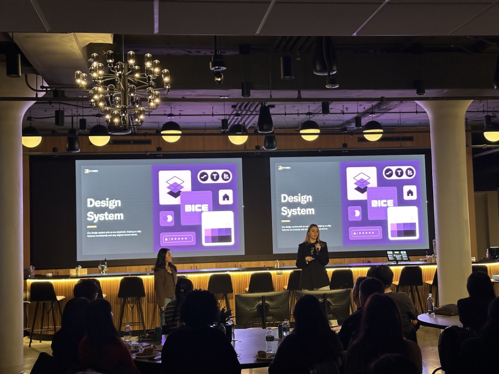
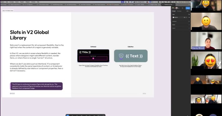
We worked directly with product designers and engineers through workshops, education sessions, and ongoing support to help them understand how to use Dice in their day-to-day work.
A big part of that was helping teams navigate the flexibility of the system, whether they needed an out-of-the-box component or a more customized experience built from shared foundations.
These conversations also gave us a continuous feedback loop, helping us understand where the system worked well and where it needed to evolve.

-
06
Documentation
To make Dice easier to adopt and maintain, we created living documentation in Zeroheight that connected the work happening across design and engineering.
Rather than treating documentation as something created after a component shipped, we made it part of the system itself.
Designers and developers could reference component usage, token architecture, accessibility guidance, and contribution workflows in one place.
This helped establish a shared understanding of how components should be designed, built, and maintained.

Outcome
A foundation teams could build on
Dice gave design and engineering teams a more consistent way to build across brands without losing the flexibility each product needed.
We replaced fragmented, one-off implementations with a shared component architecture, reduced the effort required to maintain patterns across products, and established a common language between design and engineering.
- Global components32
- Built on a shared semantic token architecture.
- One-off implementations350+
- Consolidated into reusable patterns across Sports, Casino, and Player Experience.
- Sports adoption90%
- Dice became the foundation for the majority of Sports experiences.
- Casino adoption80%
- Expanded the system across Casino, with continued integration into Player Experience.
- New features100%
- Built using the design system.
Making bigger changes possible
Beyond the immediate improvements, Dice changed what teams could realistically take on.
With shared components and semantic tokens in place, major visual initiatives like dark mode and product-wide styling updates became much easier to introduce.
Instead of coordinating hundreds of individual component changes, teams could update the shared foundations and allow those changes to carry across the experience.
What previously required extensive manual effort could now be managed through the system.
Real-life use case
A small change that used to take two years
One of my favorite examples of Dice’s impact is a seemingly simple update to the pill navigation component.
-
May 2021
The business wanted to change the pill outline from gray to gold.
It sounds like a tiny update, but multiple teams had built and maintained their own versions of the component. Before engineering could change the color, they needed to figure out which implementation belonged to which team.
The change took nearly two years to roll out completely.
-
Today with Dice
With pills consolidated into the design system, the same styling update can be made in under a minute on the design-system side and propagated across implementations in the next release cycle.
It’s a small example, but I think it captures why the work mattered.
A design system doesn’t just make components consistent. It gives teams a way to make changes without solving the same problem over and over again.
Lessons learned
-
01
Autonomy and alignment have to be defined before you build
One of my biggest takeaways was that consistency and autonomy aren’t opposites. The challenge is defining where each belongs.
If designers are told they have complete flexibility, but engineering needs alignment to ship, those expectations will eventually conflict.
A design system can support those decisions, but it can’t make them for the organization. Teams need to agree on what’s shared and what’s flexible before the system can scale.
-
02
A design system is a culture change, not a deliverable
You can build a great component library, but if teams continue creating one-off solutions and working independently, you haven’t really solved the problem.
The real shift happens when teams start thinking beyond their individual product needs and contribute to something shared.
Building the system is one challenge. Changing how people work together is another.
-
03
Understand what exists before building something new
It’s easy to get caught up in what the perfect design system should look like.
But working across a large organization taught me the importance of understanding what’s already been built, what teams actually need, and what can realistically ship.
Start with the foundations that solve today’s problems, then give the system room to evolve.
A lean component that teams can use is far more valuable than an overly complicated one that never ships.